Global chocolate brand Snickers has introduced a new custom typeface called Snickers Sans, designed in collaboration with Studio Drama Ltd.
This is a significant step in strengthening the brand’s visual identity across packaging, advertising and digital platforms. Instead of relying on generic fonts, Snickers now has a dedicated brand typeface that reflects its bold personality while maintaining consistency across all brand communications.
But the new typeface didn’t appear overnight. It started with a subtle update to the iconic Snickers logo.
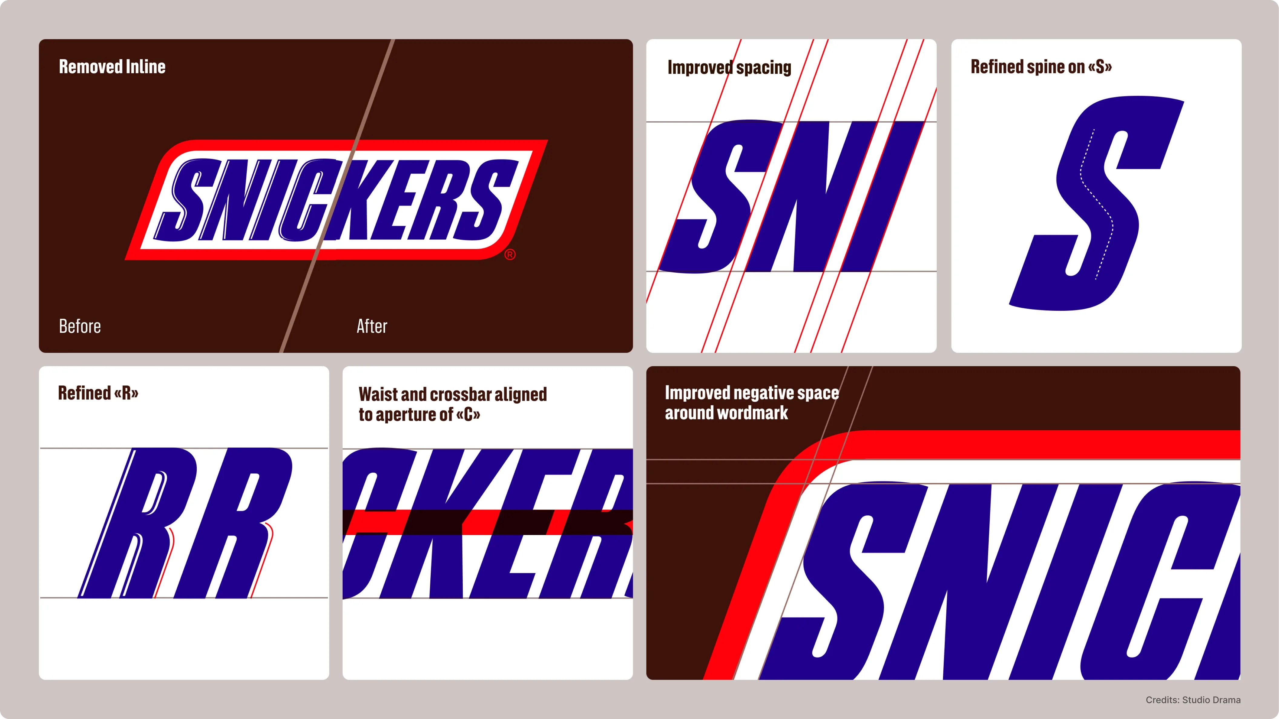
Before developing the new typography system, Snickers first refined its existing wordmark with design agency Jones Knowles Ritchie.
The changes were small but important. The inlines inside the letters were removed, spacing between characters was improved and several letterforms were carefully refined. These tweaks made the logo cleaner and easier to read across modern platforms, especially on digital screens.
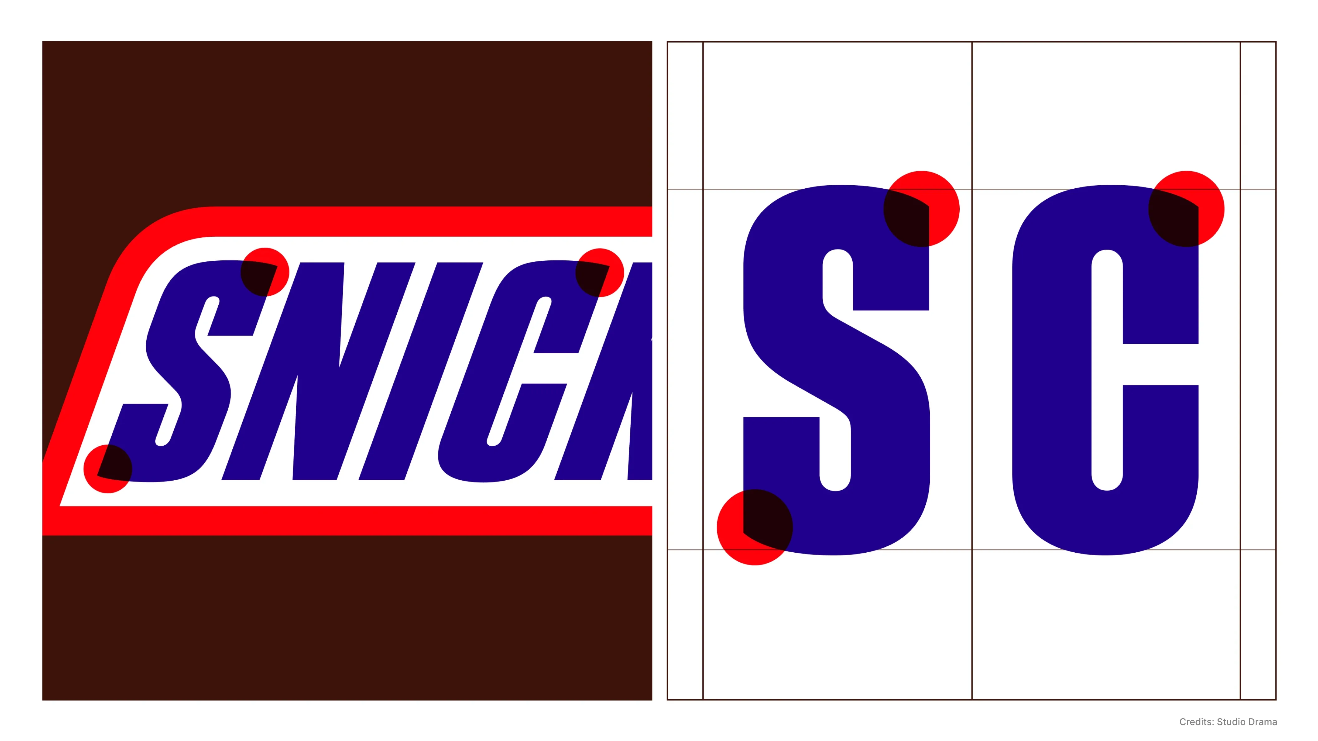
While the details were modernized, the core visual DNA of the logo remained intact. Key elements such as the distinctive spine of the “S,” the rhythm created by strong vertical strokes and the angled terminals were preserved. These elements became the foundation for building the new Snickers Sans typeface.
What Is Snickers Sans?
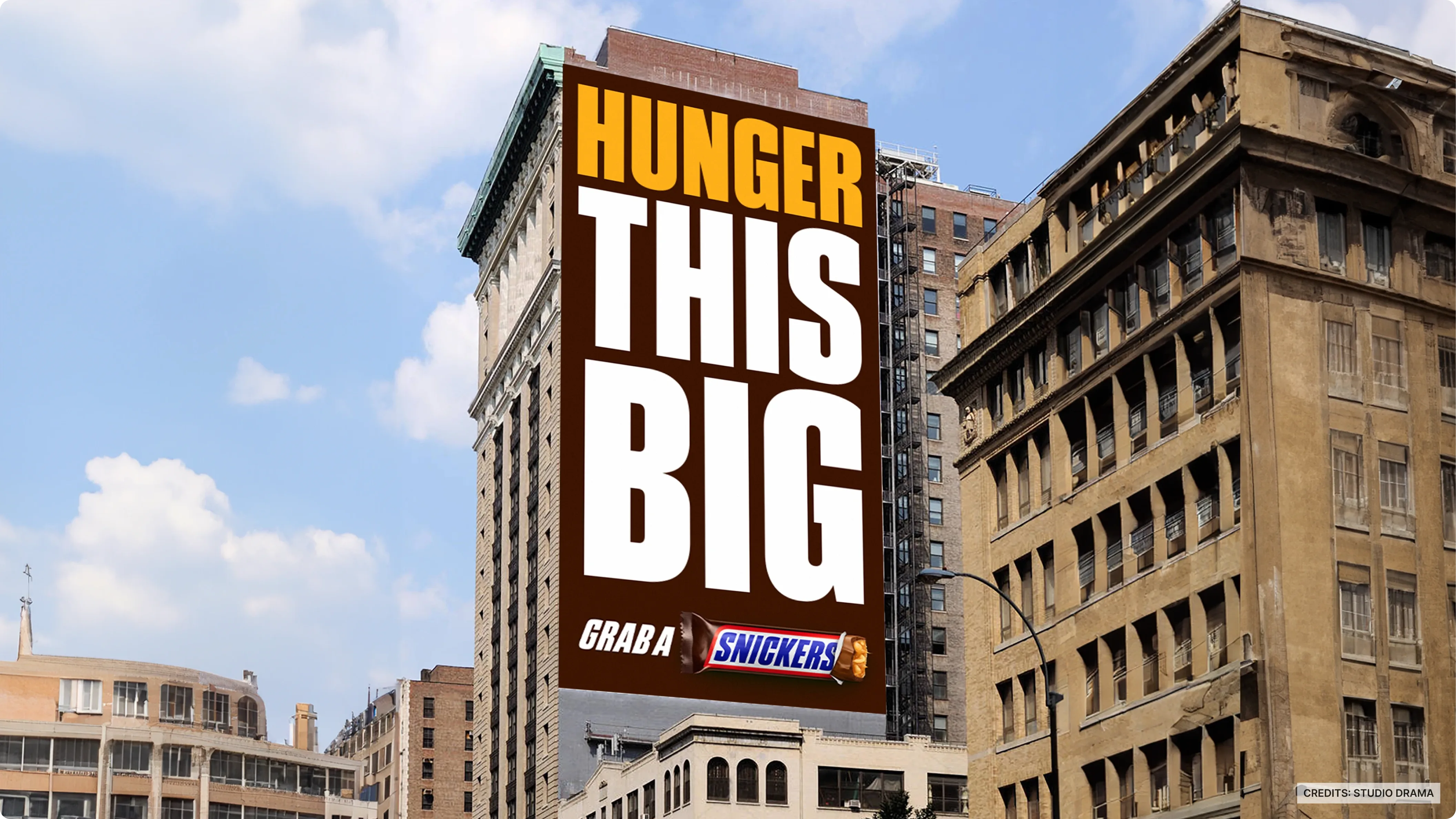
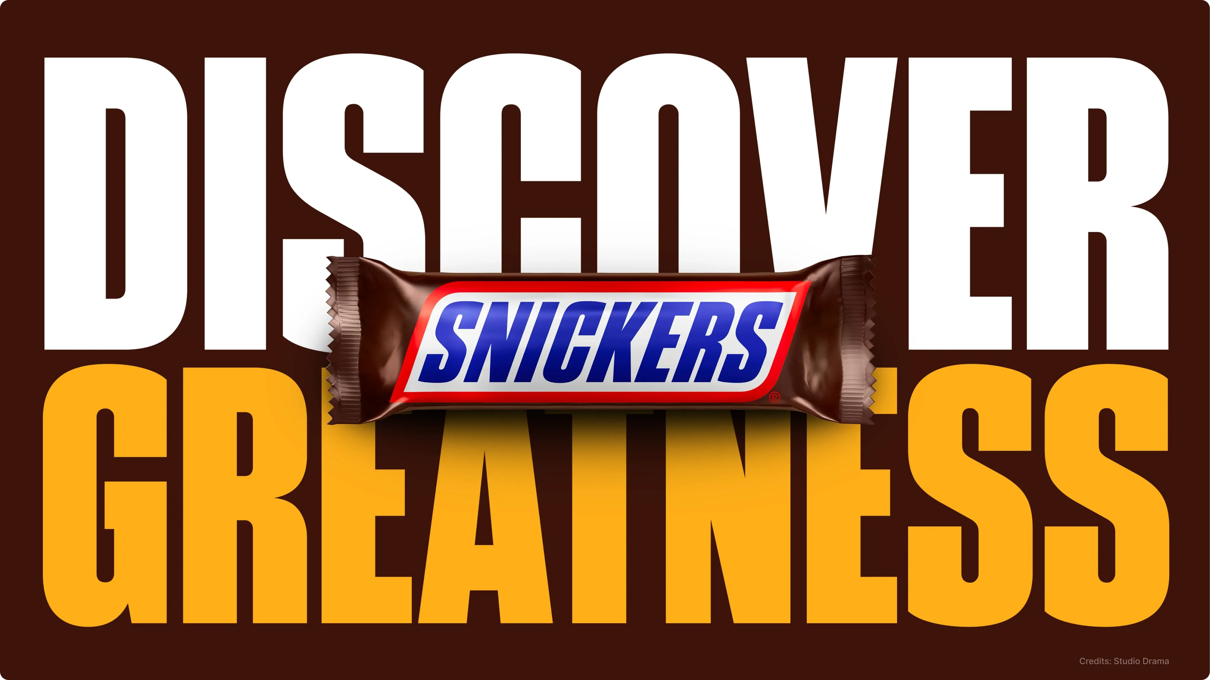
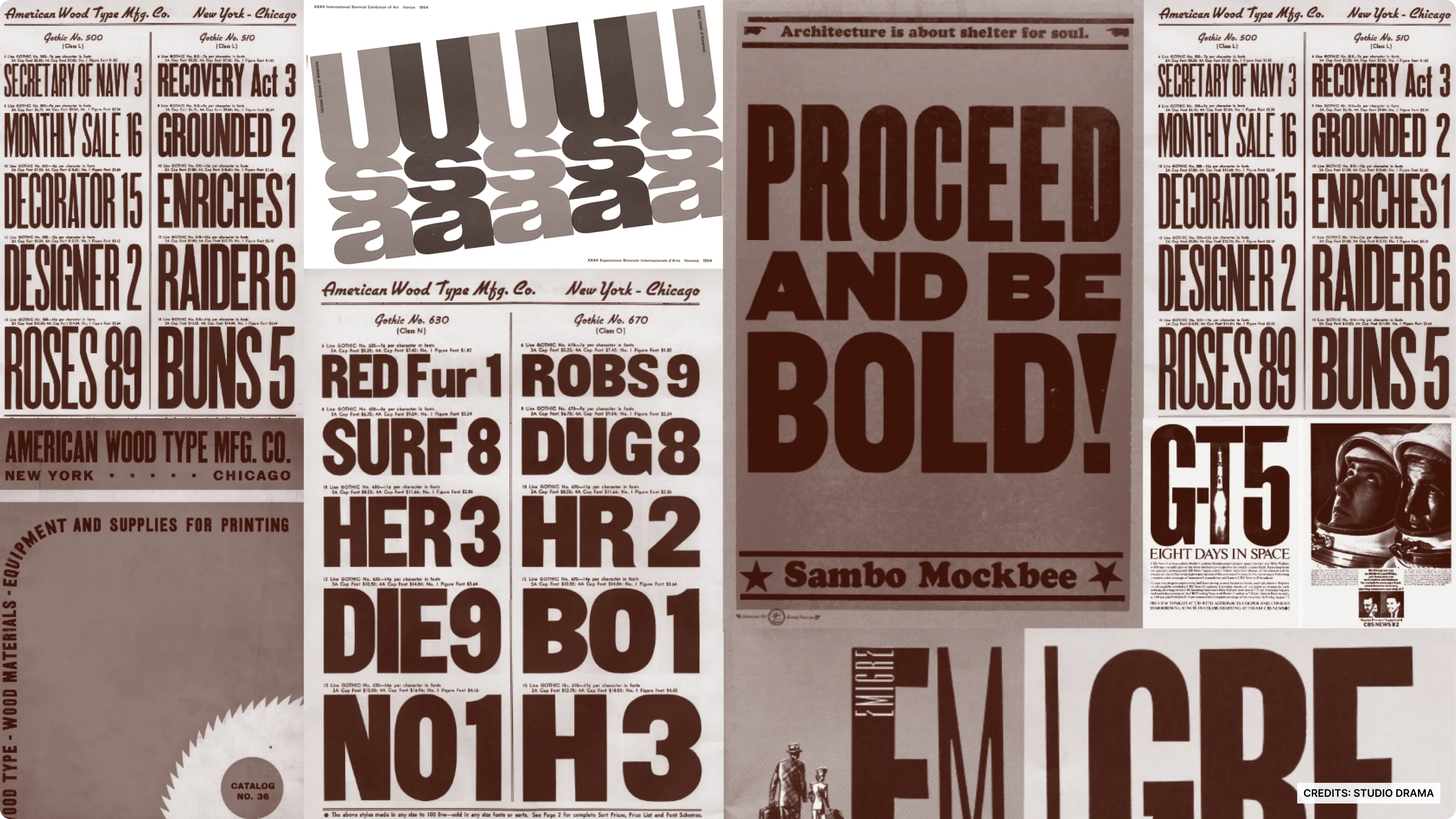
Snickers Sans is a custom brand font inspired by the structure and personality of the Snickers logo. The design draws influence from American Gothic typography, known for its bold structure and strong vertical proportions.
The result is a typeface that feels confident, energetic and unmistakably aligned with the brand’s tone. The bold proportions and sharp terminals echo the playful yet powerful voice Snickers is known for in its advertising.
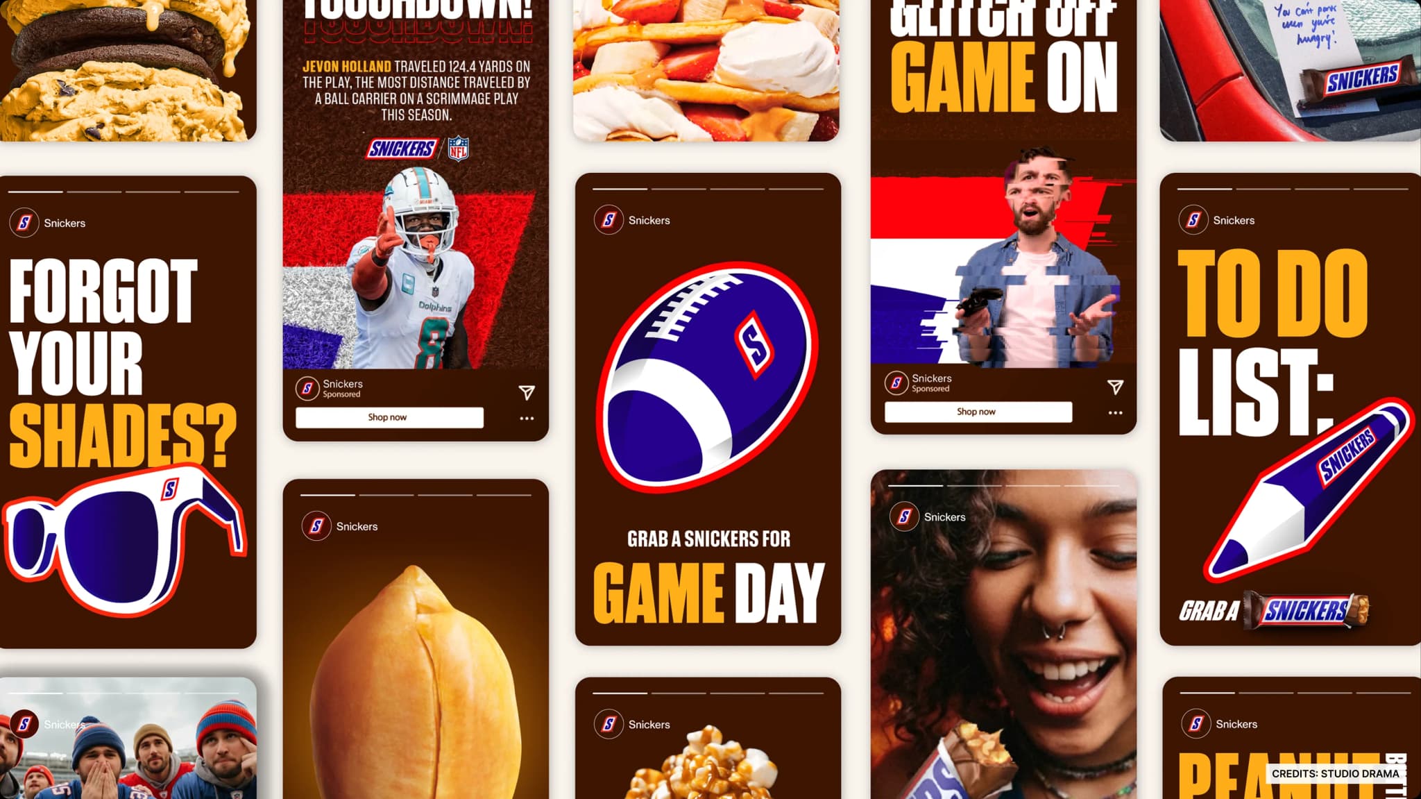
From a branding perspective, creating a custom typeface helps maintain visual consistency across everything the brand produces, from packaging and campaigns to digital experiences.
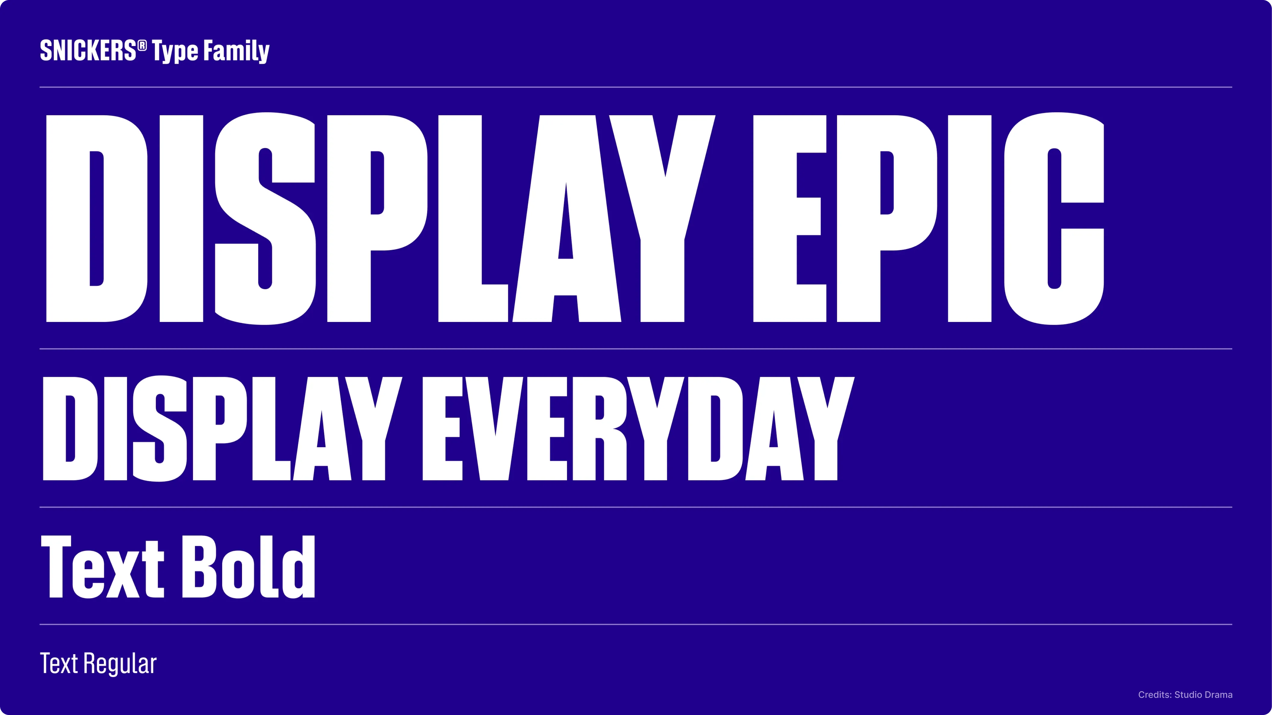
The Typeface System:
The Snickers Sans family is divided into two main categories, each designed for different uses.
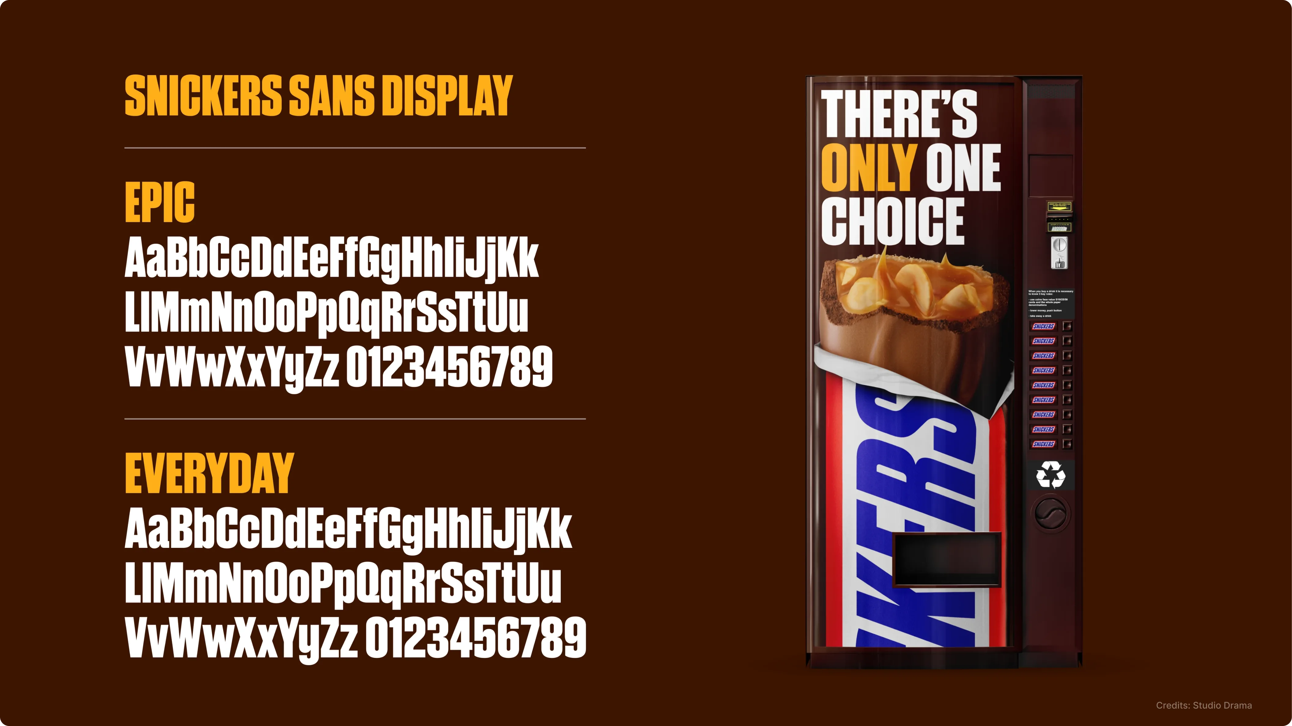
Snickers Sans Display is created for high-impact brand moments such as advertising headlines, campaigns and large-format communication. It comes in two expressive styles called Epic and Everyday, giving designers flexibility when creating bold marketing visuals.
Alongside this, Snickers Sans Text is designed for functional communication. It includes Regular and Bold weights and is optimized for product information, packaging details, digital interfaces and supporting copy.
This dual structure ensures that the typeface works across both expressive branding moments and practical communication needs.