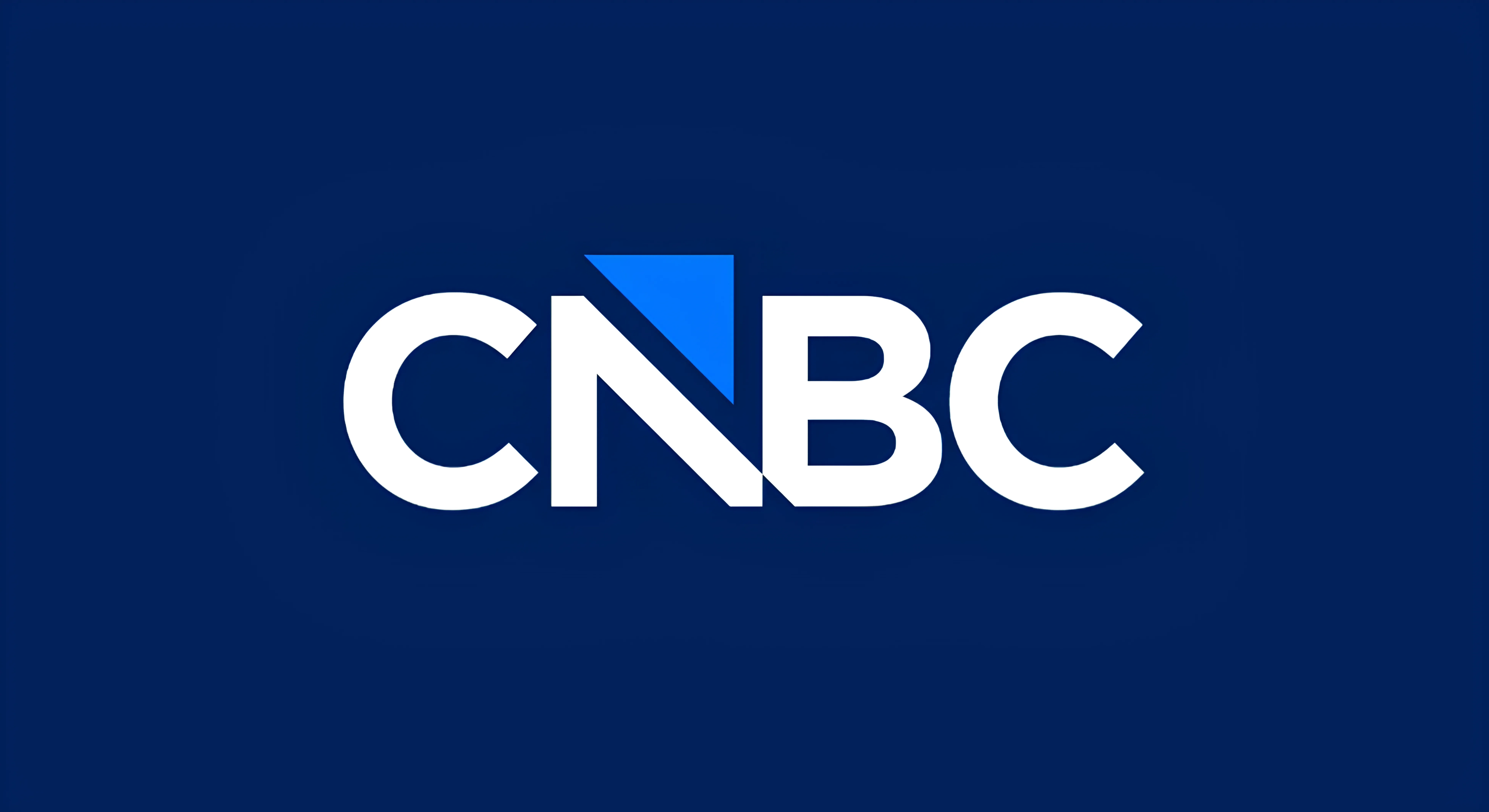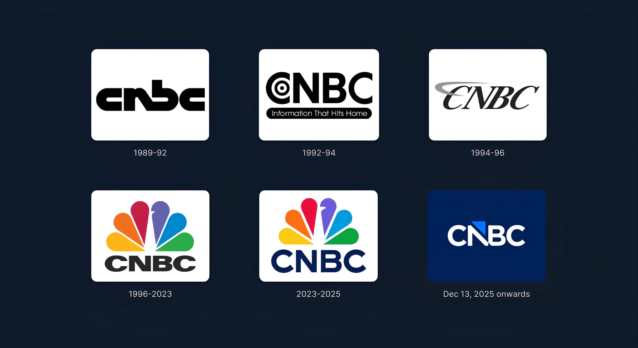
CNBC has officially dropped the iconic peacock and replaced it with a minimalist, fused “N” and “B” topped with an upward arrow. It debuts on December 13th as CNBC moves into its own new company, Versant.
And while the intention is to signal growth and “forward motion,” the reactions online are not subtle. People are calling it everything from “bank-like” to “confusing” to “a sinking ship.”
So let’s break it down properly.
Why this change matters?
The peacock wasn't just a logo but one of the most recognized marks in American media. Removing it means removing an emotion, a memory and a cultural anchor that viewers have lived with for decades.
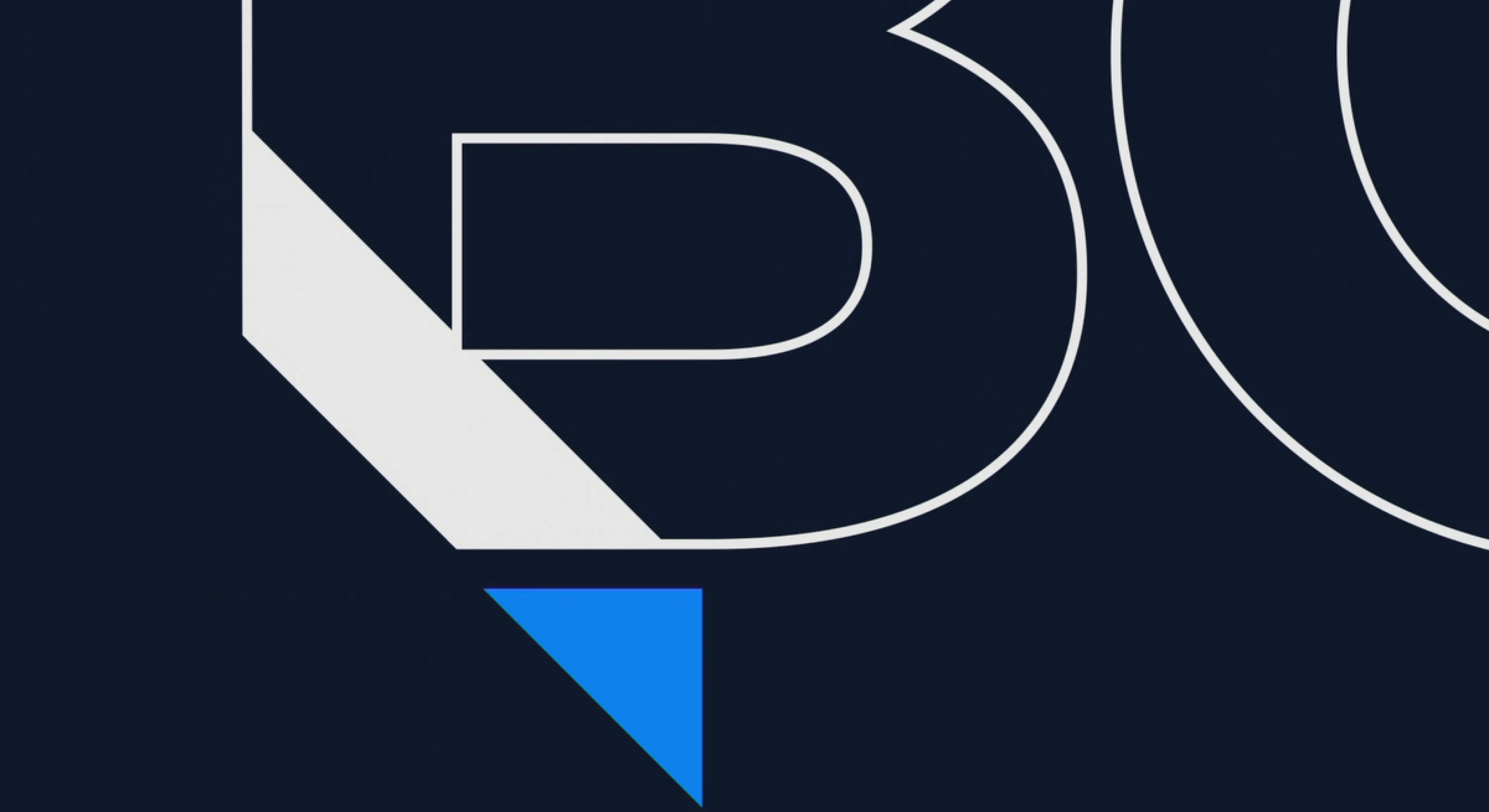
The fused “N” and “B” behaves more like a financial institution than a media network. The upward arrow reinforces themes of growth, markets and forward momentum, but without asking for emotional engagement. This shift moves CNBC away from recognition built on colour and personality, toward abstraction and authority.
By spinning off CNBC into a new corporate structure, the brand is trying to reposition itself with a more “serious,” finance-first identity. Hence the arrow, monogram and corporate geometry.
On paper, it makes sense.
In reality, it’s a massive departure and that’s why people are reacting so strongly. Logo changes hurt the most when they disconnect from what audiences emotionally associate with the brand.