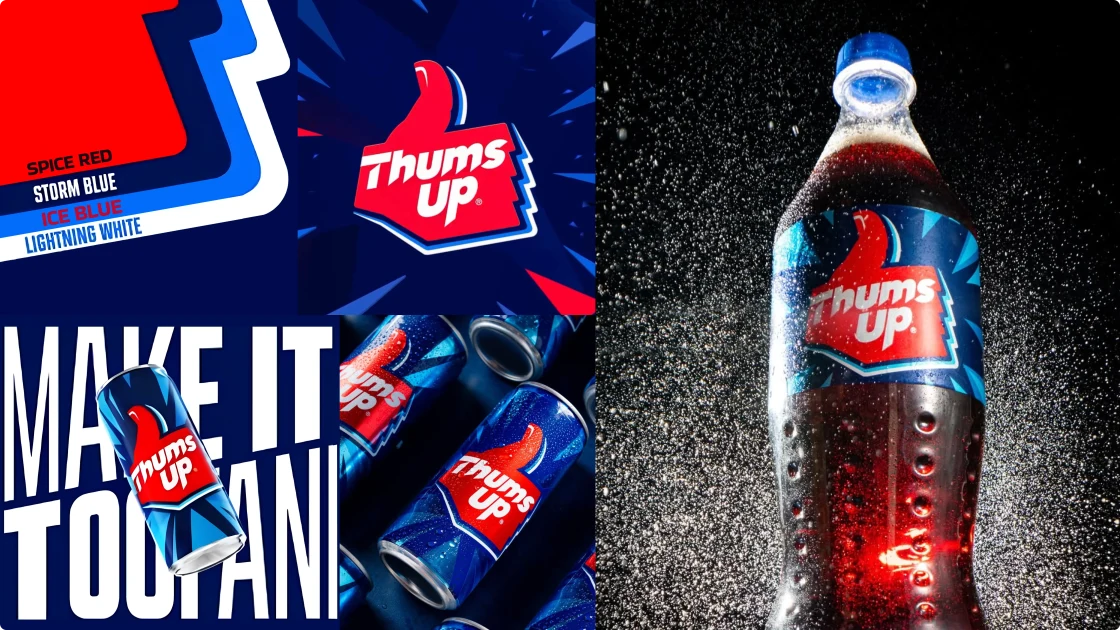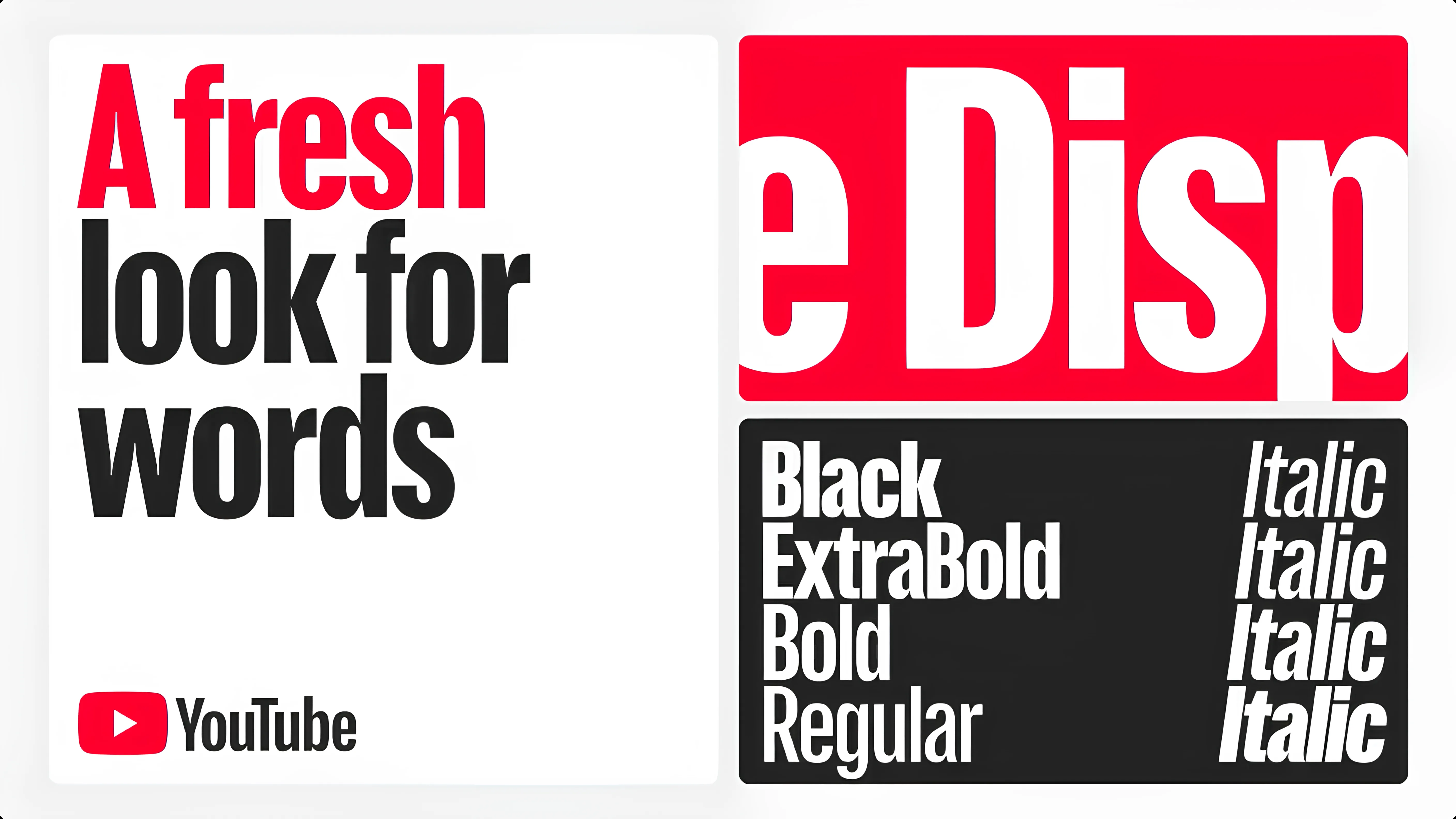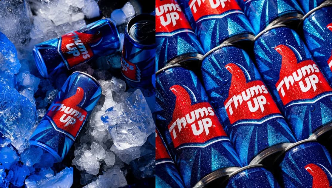
Thums Up has rolled out a new visual identity after 20+ years. The brand basically kept what people already recognise and focused on making the system work better today.
The most important thing to know is that the brand did not start from scratch. The thumb symbol, the red and blue colours and the bold personality are all still there.
What has changed is how the logo and visual system behave. The typography is sharper and more controlled. The overall design now works more smoothly across mobile screens, digital ads, apps and retail shelves.
Earlier versions were designed mainly for large formats like hoardings and TV. This update is designed for smaller screens where most people now interact with the brand.
Thums Up has always positioned itself as a youth brand. But today’s youth-first brands live on phones, not posters. This update makes sure the brand stays bold while also being readable and consistent across digital platforms.