When car brands talk about innovation, they usually talk about engines, screens or self-driving features.
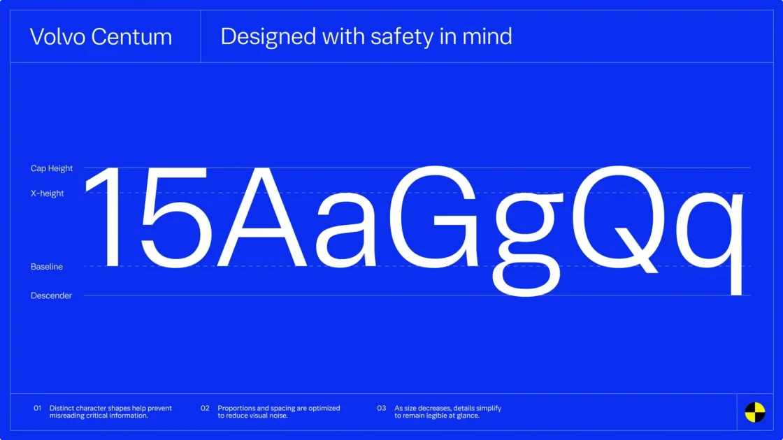
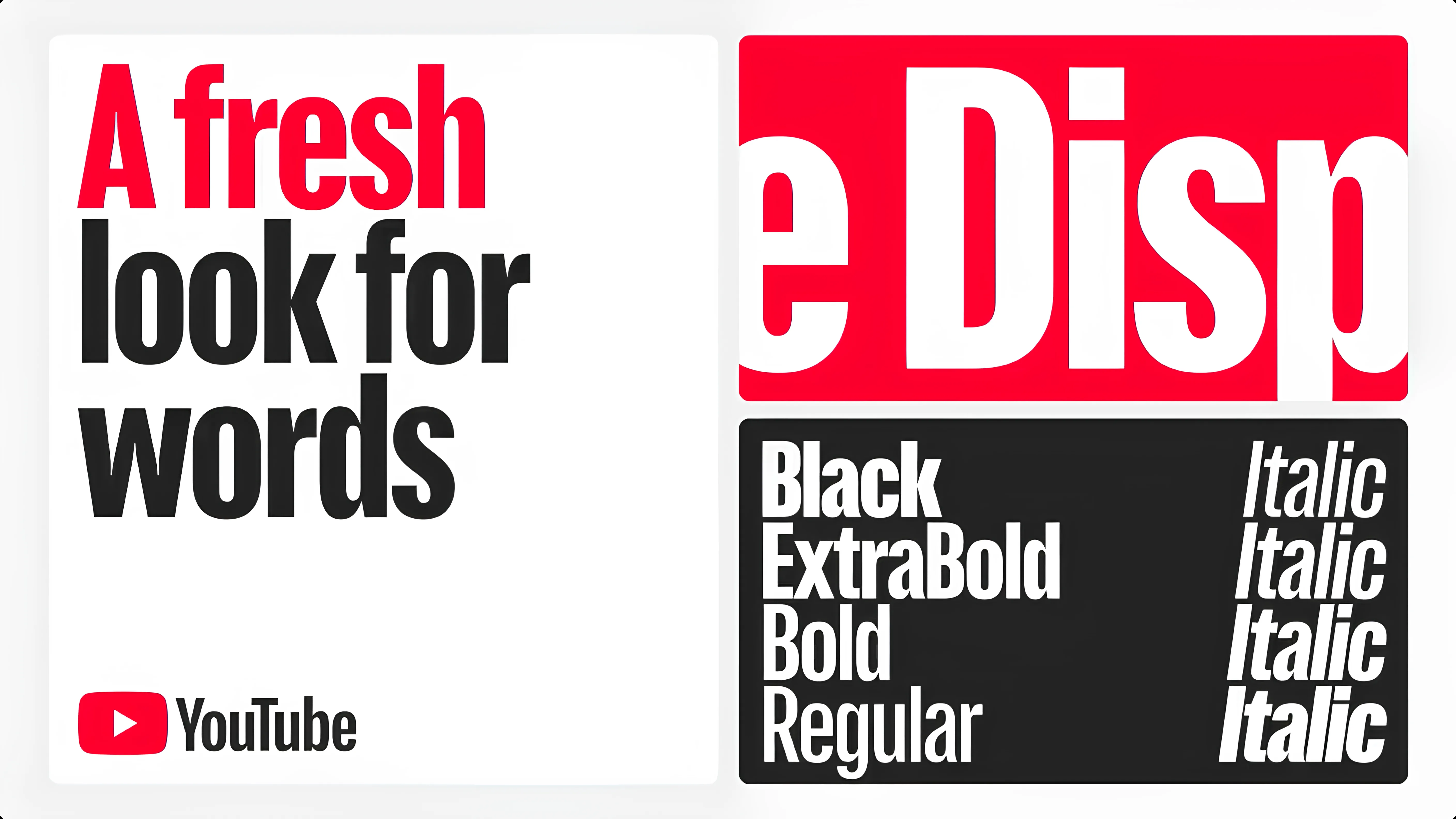
But Volvo, the 1927 brand did something very different. They designed a font.
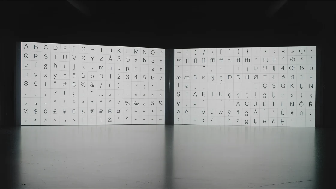
It’s called Volvo Centum and it’s made specifically for digital dashboards. The goal is to help drivers read information faster and get their eyes back on the road.
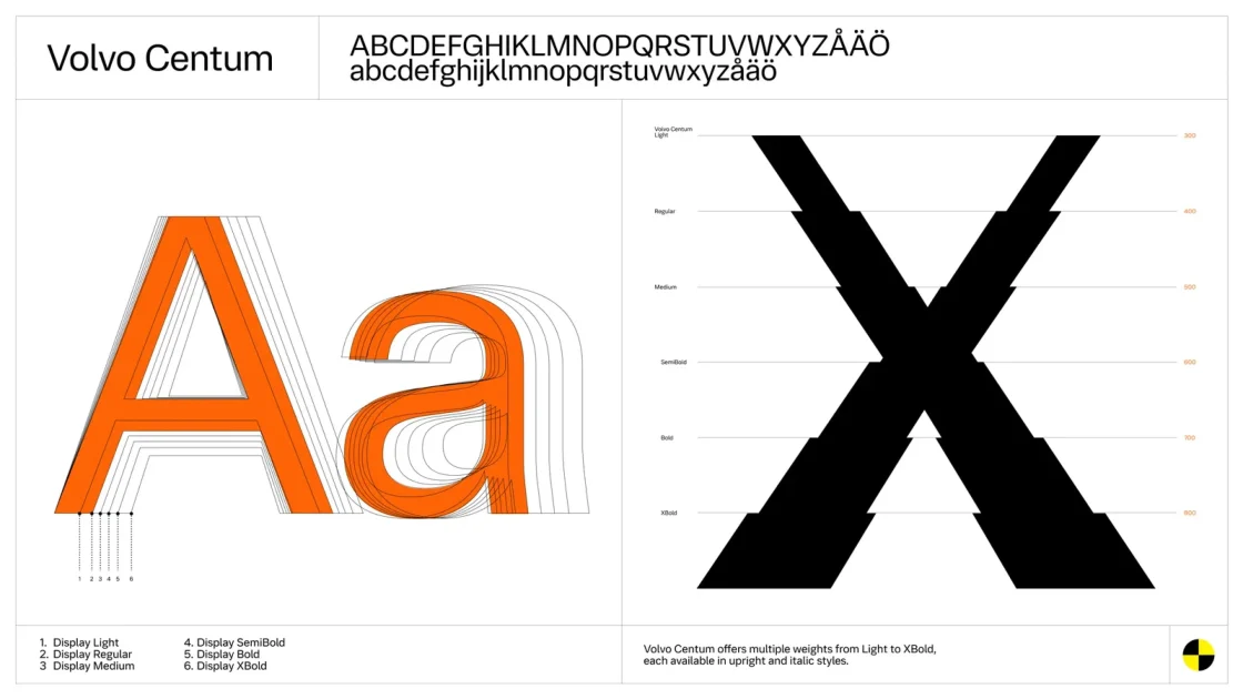
Volvo Centum is a custom typeface developed with Dalton Maag. It replaces standard fonts used on screens inside the car.
The letters are wider, clearer and easier to tell apart. Similar characters don’t look confusing anymore. Spacing is more balanced and the shapes are cleaner. All of this helps information register quickly, even when drivers only glance at the screen for a second.
Cars today rely heavily on screens for navigation, alerts, speed and controls all live there. If text is hard to read, drivers spend more time looking at the screen and that increases distraction.
Volvo is trying to reduce that effort. Instead of adding more warnings or visuals, they made existing information easier to read and that’s a design choice many brands ignore.