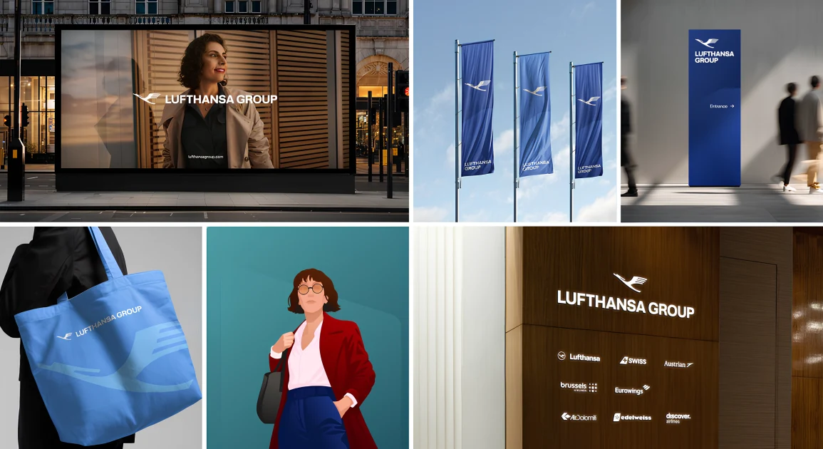
At first glance, Lufthansa Group’s new brand identity feels very simple with no loud colours or dramatic shapes.
But this update isn’t about looking new but making things clearer.
The most visible change is the crane. For the first time, it appears without the circle that has framed it for decades. This small tweak makes the symbol feel more open and flexible, allowing it to sit alongside different airline logos without dominating them.
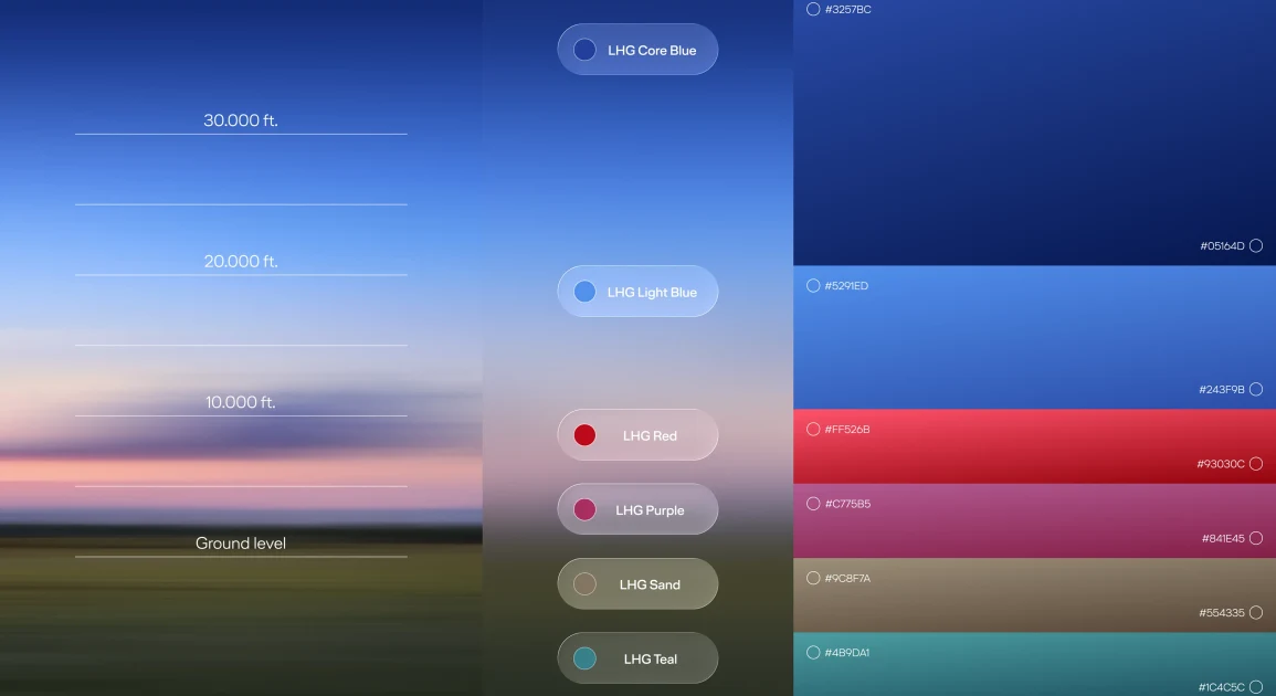
Along with this, Lufthansa Group introduced a new typeface and a wider colour palette inspired by different flying altitudes, from ground level to the upper atmosphere. These colours exist to support the system and keep everything feeling connected.
Every airline in the network now carries the line “Member of Lufthansa Group.” This shows up across aircraft, boarding passes, lounges, baggage tags and digital touchpoints. Earlier, passengers often interacted with individual airlines without realising they were part of a larger group. Now, the Group becomes visible as a shared layer of trust, no matter which airline you fly.
This makes sense at Lufthansa’s scale. With airlines, cargo, technical services and hundreds of businesses operating together, clarity matters. The redesign brings everything under one roof while letting each airline keep its own identity. It’s not meant to excite but to reassure and in aviation, that’s exactly what good design should do.