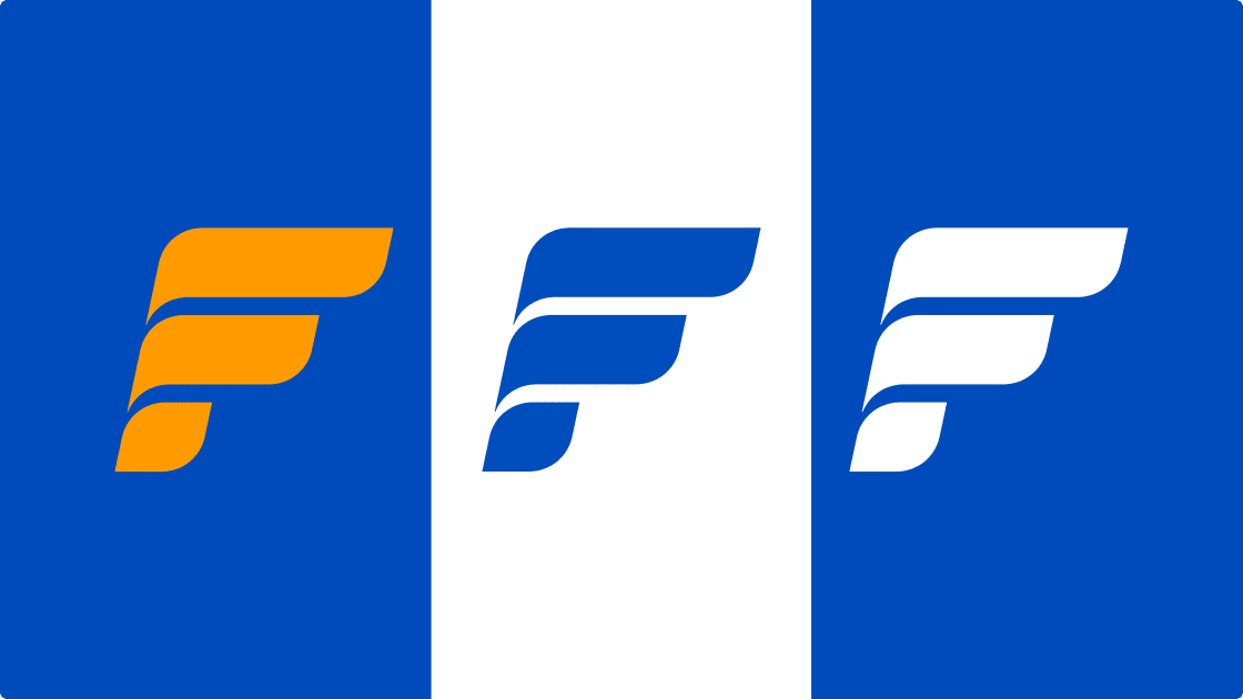
For a 94-year-old bank, change is very complicated.
You need to stay clear, familiar and readable to people who experience brands very differently today.
This is why Federal Bank introduced a refreshed logo system and a new visual device called the Fortuna Wave. The goal was to create a visual language that works across digital platforms while keeping trust intact.
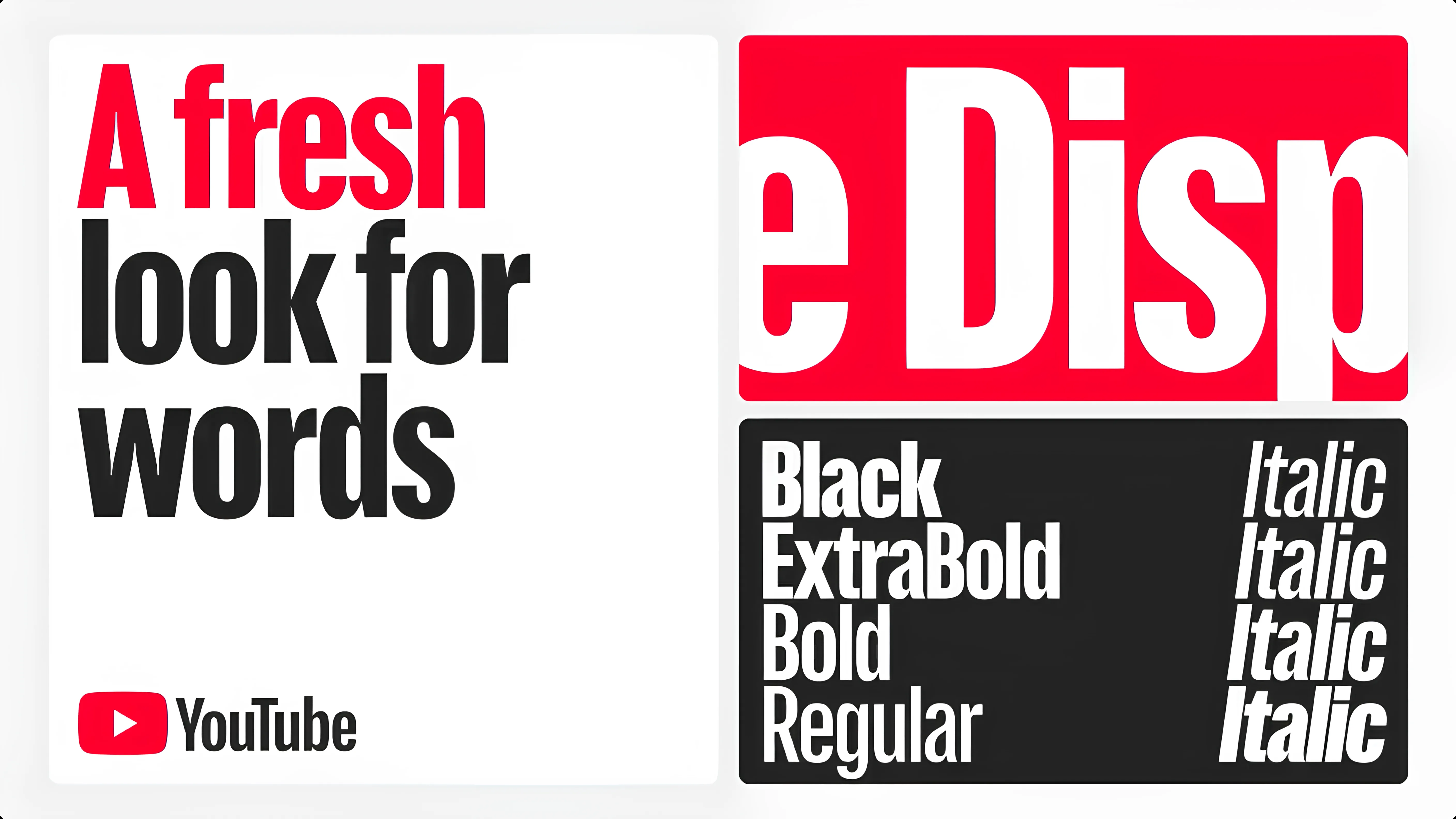
Alongside this, the bank also updated its typography, moving from uppercase-heavy communication to sentence case, making the brand feel calmer, more human and easier to engage with.
The new identity is designed to work better on mobile screens, where most customers now interact with banks. Earlier formats were built for branch boards and print.
Federal Bank has a strong multi-generational customer base. The refresh ensures older customers still feel familiar with the brand, while younger, digital-first users don’t feel disconnected from it.


